


This case study describes my role while working through two of our team's main challenges at Bank of Brazil. The first one was designing strategic features for our products while establishing a vision for the company's digital experiences. The second was evolving the design language and better supporting the design practice across the company.
Besides designing core banking features, my responsibilities involved evolving a Design Language System and setting up governance processes around the design practice. They also involved training people and coordinating work across squads to ensure product teams spoke the same language and worked productively towards creating cohesive and high-quality experiences.
Research
Concept & Strategy
Prototyping
Interface Design
DesignOps
Workshops & Training
2017 – July 2020
The financial sector is undergoing a radical shift. Cutting-edge technologies combined with an exploding entrepreneurial ecosystem have helped financial companies grow continually in number and relevance, exploring endless possibilities and spawning innovative business models and refined product lines.
Customers are also evolving, and the concept of client loyalty is quickly fading. Savvier, smarter and permanently connected, they don’t like complexity and crave immediacy. Their expectations changed, and so did their habits.
As expectations for high quality experience grew, so did the organization headcount, product lines and functionality
This drives significant changes in the financial sector and alters the balance of power between established and new players. It also changes the way people manage finances and spend their money.
As a response, many financial companies made digital design part of their fabric. Design moved quickly from a production role to a strategic one — a decisive element like any other business attribute.
Things were not different at Bank of Brazil. As expectations for high-quality experience grew, so did the organization headcount, product lines and functionality. New product teams were being established in multiple departments and growing faster than our core design team.
Since other teams relied on us for more and more projects, suddenly everything was considered “high priority”. It became harder to manage communication and coordinate work across teams and projects to ensure cohesive and high-quality experiences.
With that in mind, I pushed for a revision of our design language, tools, and processes to improve the quality and cohesiveness of our work and better support the design practice across the company.
These were the main challenges we needed to work through:
While evaluating our design language, the first thing we noticed was that evolving it would require a system-focused revision of our design tokens. While we did have basic style guidelines in place, specifications for things like typography, color and spacing were not comprehensive enough, and ended up used in inconsistent ways.
A systematic approach to design decisions improves consistency and productivity by offering a limited set of thoughtful values to choose from.
After cataloguing existing features and analyzing individual design decisions in a variety of different interfaces, we were able to find patterns and opportunities to introduce systems for core design tokens. That put us in a better position to start evolving the language.

Typesetting is one the hardest things to get right, and a without a system, it’s tough to ensure consistency. This image illustrates some of the main typographic attributes we decided to turn into a system.

Spacing is probably the most common inconsistency issue in UI design, whether it’s inside components or between them. We needed to make sure spacing and sizing values were not arbitrary. Here is a quick example of the spacing and layout scales we build.

Color plays a key role in Bank of Brazil's digital experiences, as they are used to distinguish financial categories. We normalized hues and lightness of the existing color palette and extended shades for usage in graphs, illustrations and other contexts.
After defining systems for the primary design tokens, which also included specs for shadows, border-radius, image sizing, copy and more, we were better positioned to make the design language more robust and scalable.
We also realized that the design language was failing to keep up with the emerging challenges. New business and technology challenges required new approaches to interface design. Still, our catalogue of templates and components lacked variety and complexity.
Different teams were coming up with custom design solutions — some creating different solutions to similar problems — because they couldn’t find appropriate solutions in our design language. Besides allowing for inconsistent experiences, this situation made the reviewing work quite harder.
But with our improved design tokens in place and a better understanding of how our design language was falling short, we could finally start exploring new design approaches for components and UIs. And we started with the features in our backlog.


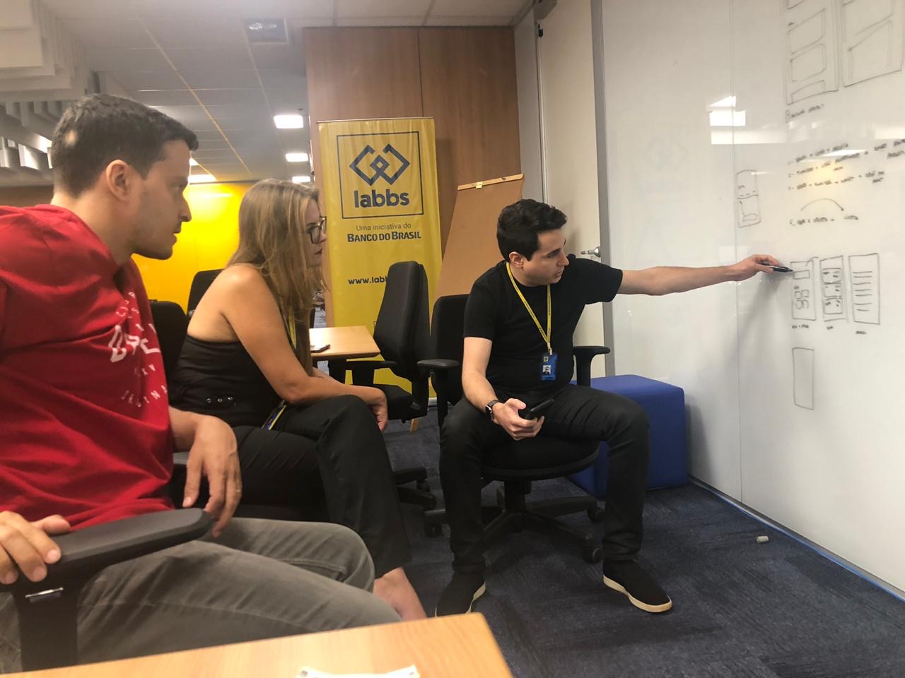
While there was plenty of space to improve how we scaled product design practices across the company, our team actively supported and nurtured a user-centered design approach. From workshops and courses about UX methods and techniques to large annual UX Conferences.

My contributions in internal events usually involved keynotes about Design Scaling and UI Design techniques. I also supported the team with other User Experience related events across the company.
Our next area of focus was to improve how we shared the design language, tools and assets with product teams. We started with enhancing our existing UI Kit, publishing a website to host the documentation and assets and offering design workshops.


This is a challenge the company was still actively working through by the time I left: trying to find a balance between a continuous evolution model and our goals for high quality standards and productivity.
Since we've established the new design language and started to scale it across the company, other product teams have been able to create higher-quality and more cohesive products and features. And I believe that's because it helped them focus more of their energy on their specific business challenges and user needs.
Within less than two years of the introduction of the design system, the number number of in-app sales of products such as loans, insurances and investments grew by 47%, and the number of mobile users increased by 17%.
Other areas our team was working on involved ensuring we had solid standards for governance, design reviewing and updates. We were also studying how to introduce an effective design system contribution model.


